Brand Identity & Symbolic Architecture
Brand Identity
Brand Card
Brand Illustrations
Brand Card

Problem
Space Meridian needed a zero-to-one brand identity that bridges abstract Web3/cryptographic concepts (zero-trust, observability, recursion) with tangible physical phenomena. The challenge was structuring a methodical discovery process that could translate complex technical foundations into a clean, timeless logo mark.
Solution
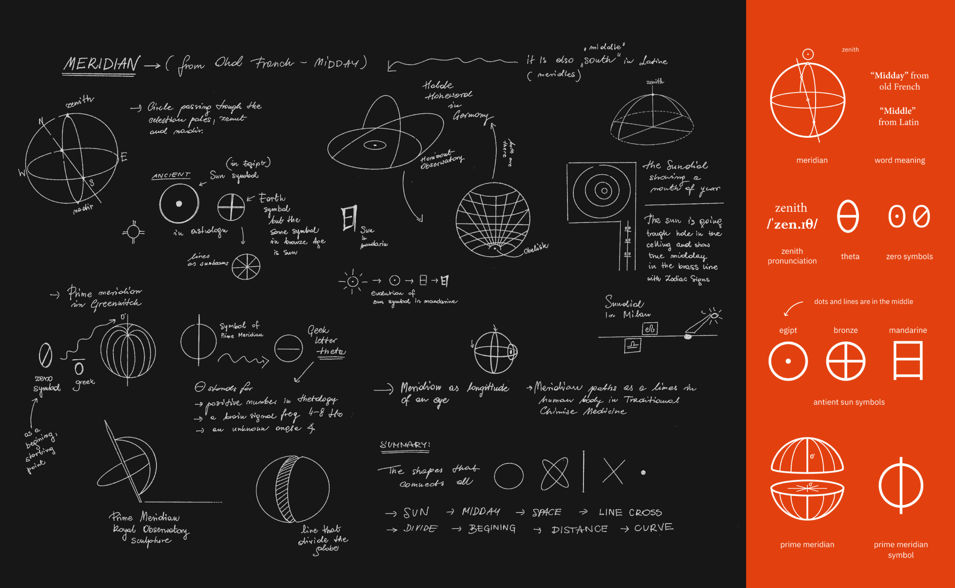
Initiated discovery with a Visual Mind Map centered on the brand name, systematically sketching connections between cosmic geometry, math, and earth elements. Through iterative typographic and iconographic exploration, candidate marks were stress-tested for scalability across digital and physical formats before selecting the definitive concept.
The Winning Mark (Logo B): Selected for its rich, multi-layered symbolism that directly reflects the protocol's core technical pillars: • Sun & Gravity: Symbolizes central energy and gravitational forces holding space meridians together. • Mathematical Theta: Anchors the identity in precision, angles, and rigorous verification. • Orbits & Meridians: At scale, mirrors planetary orbits and navigational lines across space. • The All-Seeing Eye: References continuous monitoring and deep verifiability. • Zero Symbol: Direct homage to zero-knowledge proofs (zk) and zero-trust security architecture. • Möbius Strip: Captures infinity, recursion, and continuous execution. • Natural Color Palette: Grounded the cosmic identity in Earth-inspired tones—ocean blue, plant green, rock yellow, soil red, and wood brown—creating a harmonious bridge between deep technology and natural existence.